Data dispatch #1
Effective figures change how you see the world
As every scientist knows, a good graph says more than a lengthy article. But powerful images can also tell a one-sided story. Here are two data visualizations that I found particularly striking recently—and that deserve some additional explanation.
1. Visible trends?
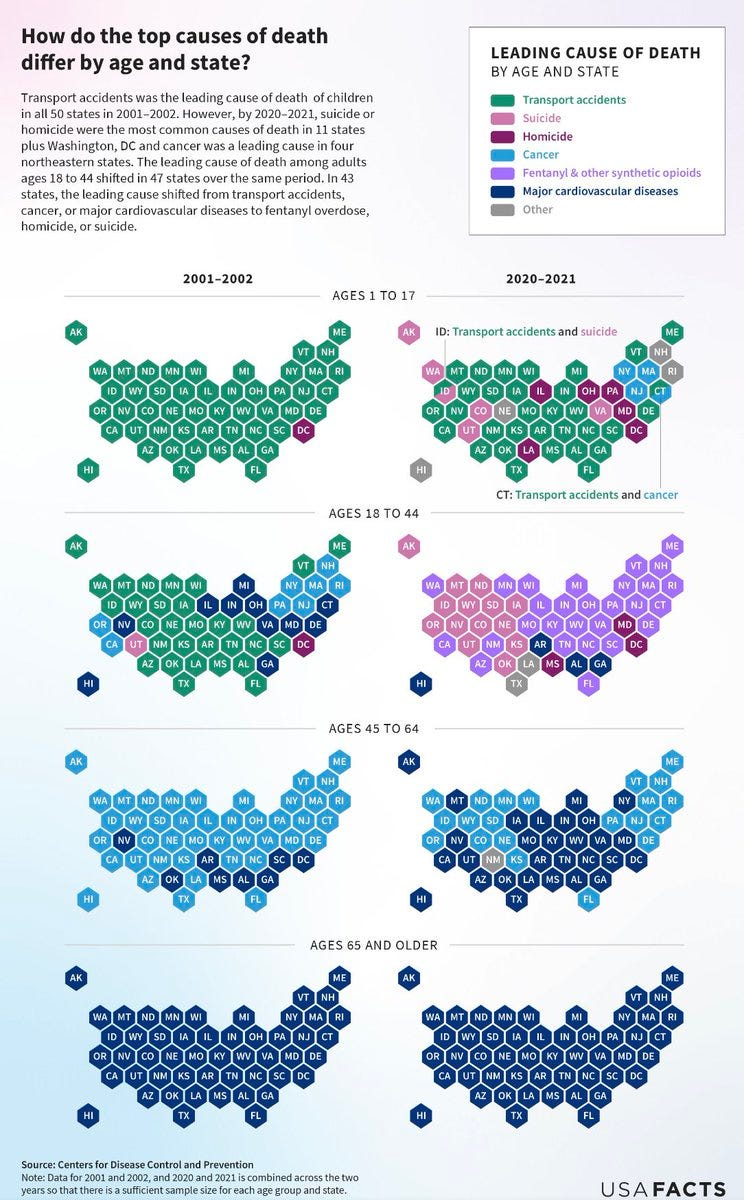
The following infographic made the rounds on X and Reddit. It pictures the leading cause of death in all U.S. states for four age brackets, compared between the periods 2001-2002 and 2020-2021.
It’s an attractive visualization that highlights changes over time with bright colors. Most prominently, people aged 18-44 seem to be dying more from “deaths of despair” including suicide and opioid overdose.
The importance of the opioid epidemic can hardly be overstated. When I attended a talk on the topic a few years ago, I was shocked to learn that synthetic opioids were taking more lives in the U.S. each year than the total number of U.S. soldiers killed in action in the Vietnam war. Yet public outrage over opioids pales in comparison to the antiwar protests of the late 1960s. More science communication on the topic is needed and I will try to dive into it in this newsletter when I have the time.
However, we need to be careful when interpreting this visual. First off, these are relative data that tell us which cause of death is most common at a given time, nothing more. It’s easy to look at the 18-44 age bracket and think “transport deaths went down and suicide went up”. But based on just the leading cause of death, we can’t say whether either of the two became more common, less common, or stayed about the same—just that the relationship between them flipped.
The colors of the graph are also misleading. When plotting mutually exclusive categories of something, such as the causes of death here, a scientist will usually pick a color scheme in which each color looks about equally different from the rest. In this case, however, cancer and cardiovascular disease are both shades of blue. This understates the changes in the 45-64 age group and focuses our attention on the younger people. This is particularly egregious given that death is more common as age goes up. The real headline might be that we have gotten much better at treating cancer.
Finally, 2020-2021 were pandemic years when everything was different. Lockdown measures changed the way we lived, worked, and traveled. This period is not comparable to 2001-2002, so the trend over time is barely interpretable. (Interestingly, although road use went down during the pandemic, traffic deaths actually increased. Not sure how that affects this graph.)
If anything, this graph makes us think about how the circumstances in which we live—as they change over time—shape our health outcomes. This is a fascinating perspective and will remain a central theme of An Educated Guess.
(A final note. I can’t find the graph on USA FACTS, so perhaps they took it down. But on social media it’s alive and kicking.)
2. Game face
Let’s end on a more positive note. Budapest-based data visualization designer Krisztina Szucs developed with an beautifully original way to animate the tension of a tennis match. The GIF for the 2023 Wimbledon final between titans Alcaraz and Djokovic is below.
Time runs from bottom to top, set wins are labeled with colored horizontal lines, and break games that tip the balance are marked with dark rows. Pay attention to the lengthy but decisive third-set break game for Alcaraz, which occurred around the mid point of the entire mach. This was the tipping point in the face-off—and dominates the graph itself.


